Experiments — Uncapped

UI / Experiments

One of the main objectives for the product team at Uncapped in early 2022 was to become more data-driven.

As a design team, we were happy with the progression of our qualitative research practices but we were super excited to be given the space to improve our quantitative research repository too.

We knew that this would allow us to make far more rounded UI/UX decisions and would in turn, allow us to release projects with greater confidence that our users will use them as we intended them to.

I plan to use this page to document these experiments on an ongoing basis.

May 2022

Sign Up Page


Problem

We had been aware that our sign up page was a conversion bottleneck for some time. Customers were educating themselves on our marketing website, clicking our 'Get Funded' CTA, landing on this page and then exiting.

Approach

We wanted to move quickly, so we started by analysing Hotjar recordings of the page but unfortunately, we couldnt draw any solid conclusions as to why some users were leaving the page.

Next, we scheduled two brainstorming sessions with the Onboarding team and came up with the following assumptions -

Users landing on the sign up page feel blocked by having to sign up and feel that the process is going to take too long
We have not built enough trust between Uncapped and the user at this point and users feel signing up is too much of a commitment

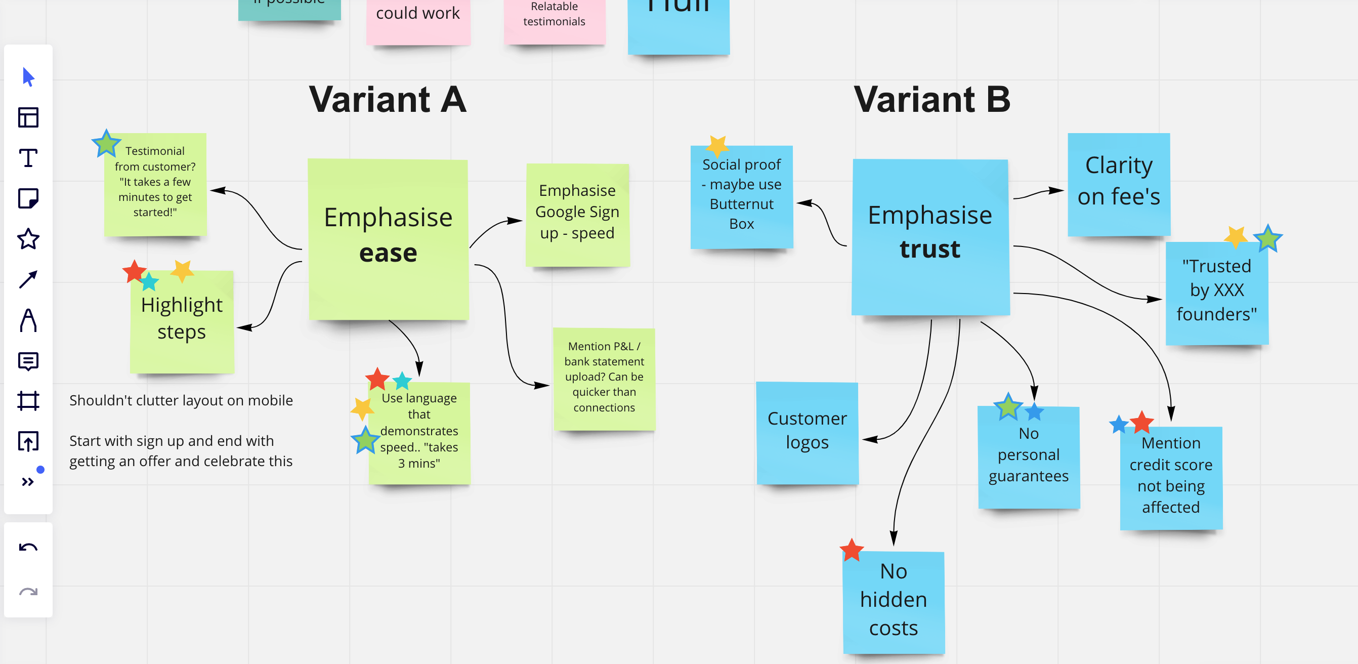
A screenshot from one of our brainstorming sessions

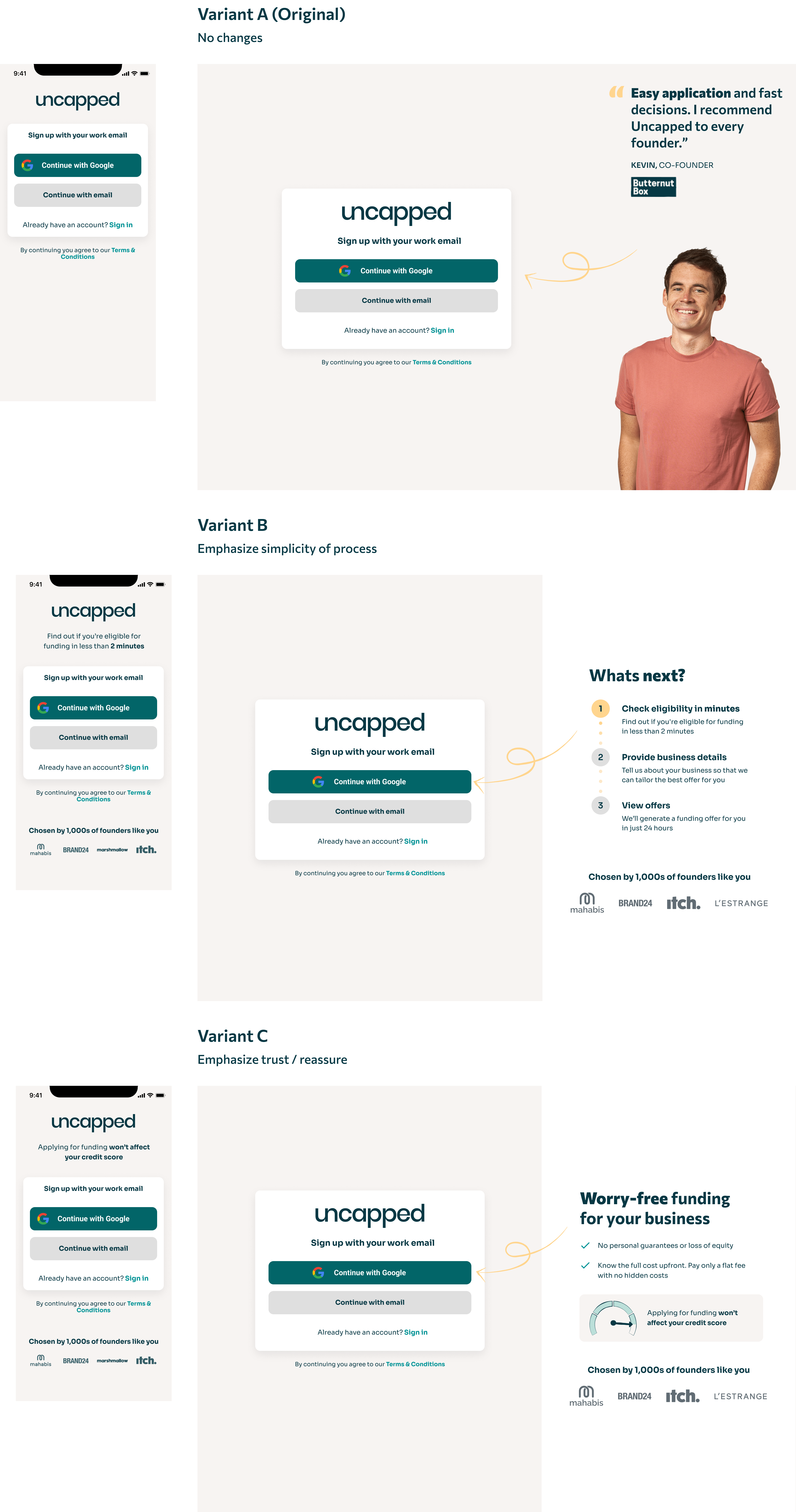
I then took the agreed assumptions and designed two variants to test against the existing sign up page -
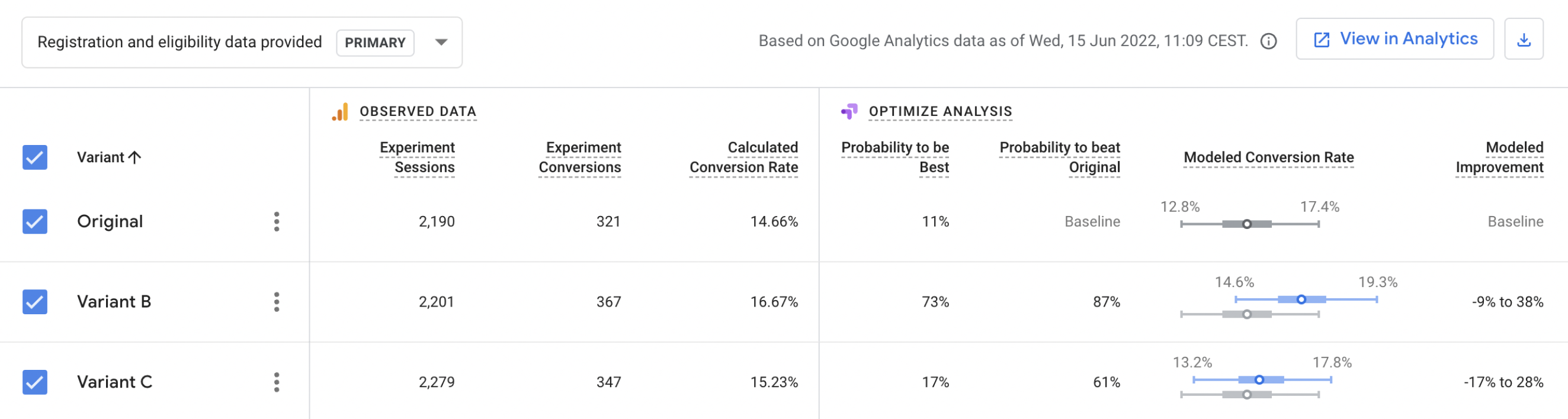
Results

The experiment ran for two weeks with Variant B (emphasising simplicity of the process), proving the most impactful in increasing conversion rate from this page to the page that followed in the UX.

March 2022

Incremental Progress Bar


Problem/Assumptions

Applying for funding requires a lot of due diligence. As a designer in the Onboarding team at Uncapped, it has been my job to ensure this process doesn't overwhelm customers. Prior to this experiment, we communicated a nine-step progress bar to customers. Our assumption was that this was creating a sense of overwhelm.

Approach

In order to prevent cognitive overload/overwhelm, we designed a solution that would hide the final three steps of the onboarding process in the progress bar until the user had reached the point of receiving their offers.

Our hypothesis for this, was that at this point, there would be an element of motivation as the user will have received their offers and would therefore be more likely to complete the final three steps.

Results

The experiment ran for a total of eight weeks with the incremental progress bar showing a slight increase in conversion at around 5%.