UI / UX / Research / Data
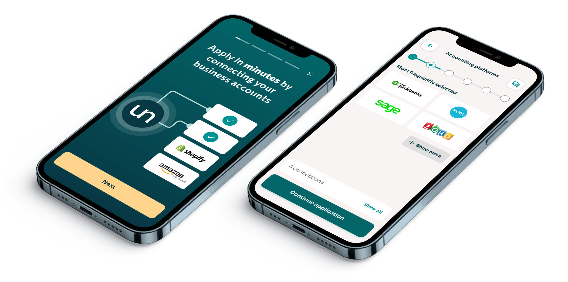
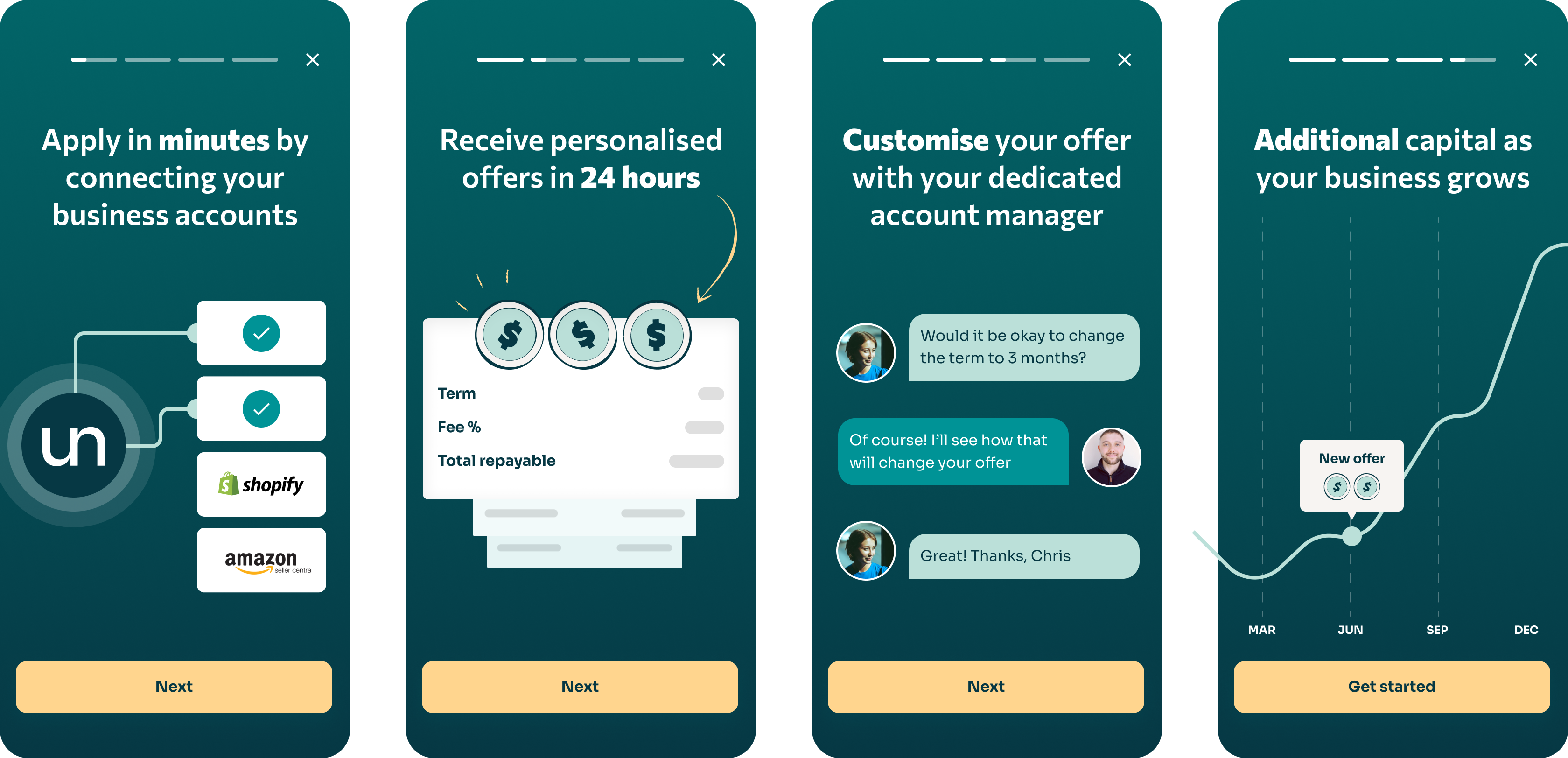
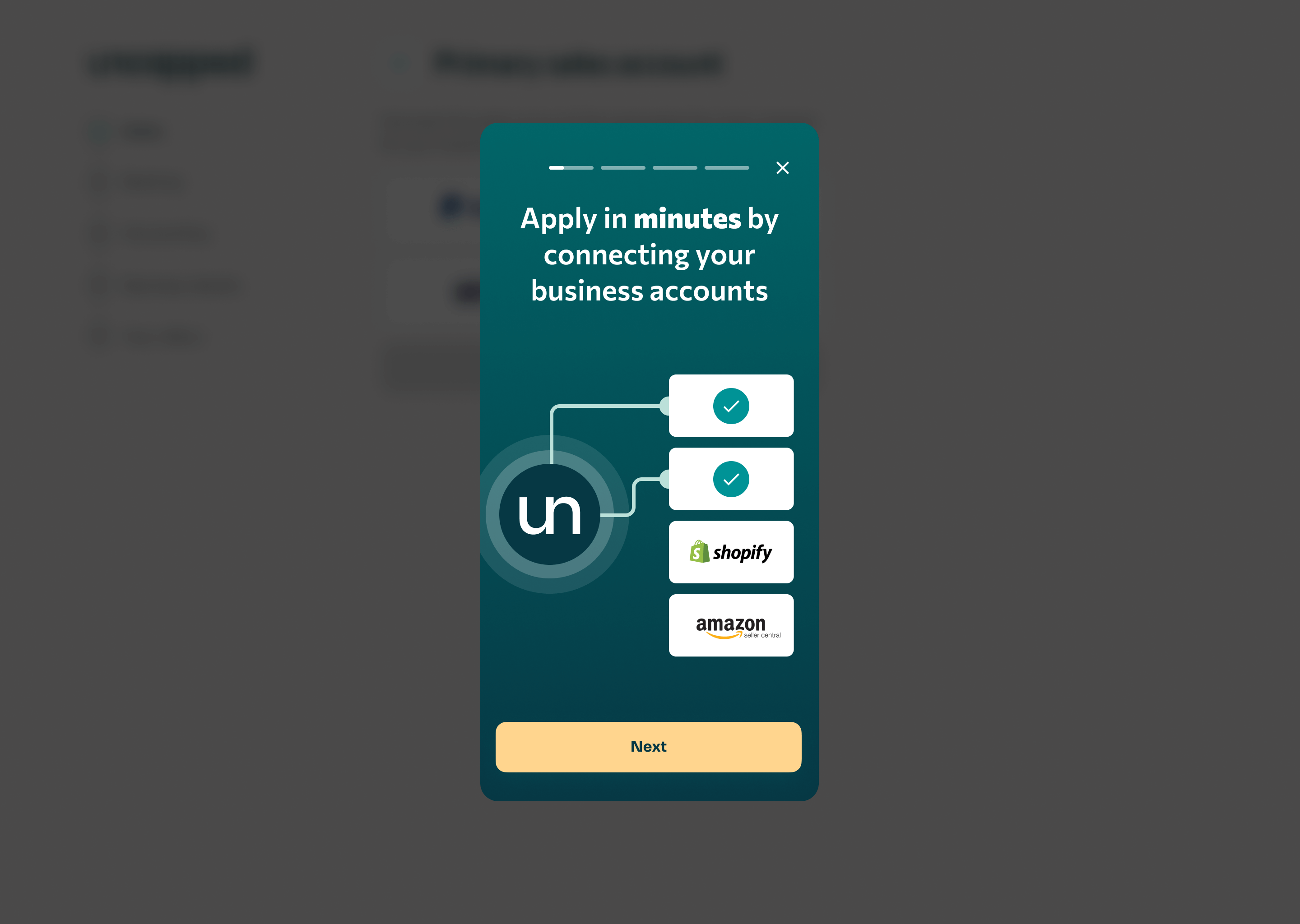
Uncapped is a fintech scale-up providing revenue-based financing for e-commerce businesses. Founders receive capital that is then repaid as a percentage of their monthly revenue. If revenue falls in a given month, repayments decrease accordingly.
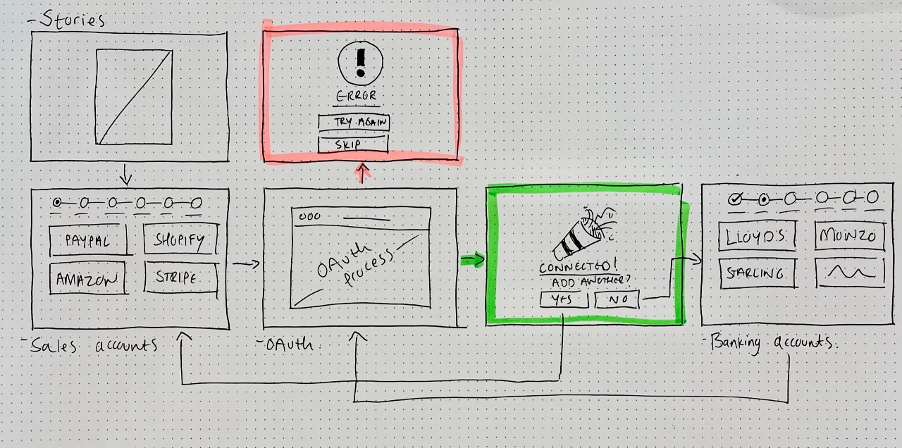
To qualify for funding, customers connect their sales, accounting, banking, and marketing platforms. This data allows the underwriting team to assess eligibility and risk. In early 2022, my team was tasked with redesigning Uncapped’s legacy connections experience.
Lift in connection completion
Fewer connection errors
Scoping was made relatively straightforward from an engineering perspective since Uncapped already had a live legacy connections flow and the backend required little improvement. The bigger challenge was deciding how much to invest in the MVP's UI/UX to ensure meaningful impact.
The project PM and I defined the MVP's acceptance criteria and moved non-essential features to the backlog for later releases -
Customers need to understand why they are connecting their accounts.
Customers can connect sales, accounting, banking, and marketing platforms via OAuth.
Customers can upload a profit and loss PDF if they can't connect a sales platform.
Customers can upload a bank statement if they can't connect a banking platform.
Customers can track their progress toward submitting an application.
Customers can see which accounts are connected and which documents are uploaded at all points during onboarding.
We chose to release the project in three phases, prioritizing a quick MVP launch which would then inform later design decisions -
Three-step release plan
Flowchart created to detail OAuth processes in the legacy platform
User interviews showed that 24% of customers questioned why they needed to connect their accounts.
Four 'Story' frames were created to explain the benefits ahead of the connection step.
Story designs (mobile UI)
Story designs (desktop UI)
The legacy system allowed users to access connection sections in a non-chronological order. Analysis showed that when users followed a non-chronological flow, they were likely to exit the process earlier.
Our underwriting team needed all sections to be completed in order to generate funding offers and so we decided to restrict the UX to a linear flow.
Data showing users following a non-chronological UX
The flow was designed to guide users through the connections that were less error-prone first in order to encourage momentum.
Early sketch
Once stakeholders had approved the UX, I created high-fidelity screens, keeping the design simple; reusing existing components where possible.
Progress Bar: Users could view completed steps but couldn't skip ahead without finishing the previous step.
Sidebar: Remained visible on every page to give users context. It displayed both connected accounts and uploaded documents.
Continue CTA: Remained disabled until the user added at least one connection.
While OAuth was the preferred method, some connections required manual login. For both consistency and speed, we reused much of the OAuth UI/UX for manual connections too.
The sidebar displayed connection instructions, while the central column held input fields for access keys and other required details.
OAuth permissions varied across platforms, so we had to carefully design the options available to users when errors occurred.
We found that third-party error messages were unclear and unhelpful for customers (see screenshot below). To improve the experience, we offered three clear options when a connection failed—without exposing the raw error message.
Raw error messages returned by a third-party app
We maintained an iterative approach throughout, by interviewing and learning from potential users. We tested with non-customers on a weekly basis via Respondent. The tests consisted of both interactive prototypes and flat, Figma frames.
We had a tight five-week deadline. However, by running five one-week design sprints, we broke the project into manageable development slices and managed to ship something of value.
We saw an 82% conversion lift (early data, one week post-release). With the project live, we'll now use quantitative analysis to further improve onboarding.